Responsive web design and development
Responsive design, based on layouts that adapt to any screen size and device, is the new gold standard of user experience design. New devices are creating new interaction patterns with content propositions, that result in new structures across devices.
Assembly 21 designs with a mobile-first methodology and develops websites across devices to enable best experiences for all users and all accessibility requirements.
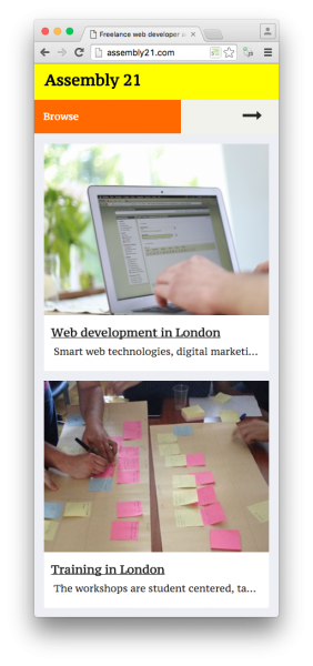
Mobile view in portrait orientation
The design is very clear and readable in small devices.
Mobile view in landscape orientation
If you rotate the device, this is how it looks.
Tablet view in portrait orientation
All screen sizes are covered, so if new devices enter the market, your website is prepared.

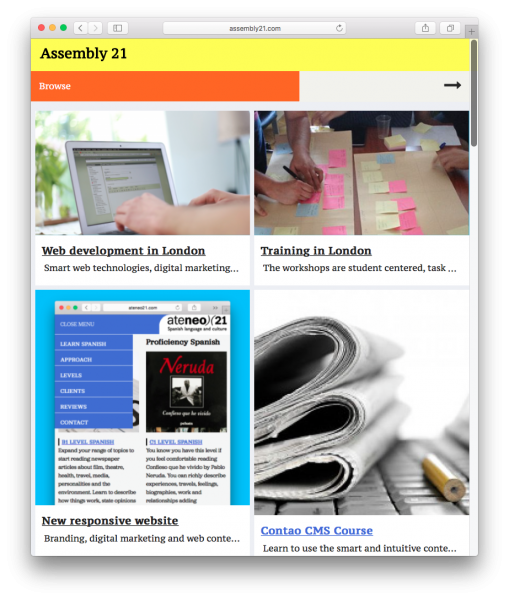
Desktop version
This design covers laptos and desktops both small and large.
